
Scientific Visualization Images - Interactive Graphics
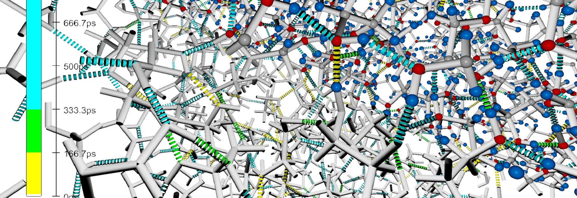
 and life-time (color). Dielectric loss spectra for different EG mole fractions show an overestimation compared to the experimental results. Data by Alexander Kaiser, <a href=\"https://www.uibk.ac.at/ionen-angewandte-physik/index.html.en\">Department for Numerical Chemistry</a>, University of Innsbruck.")
Analysis on the dynamics of the mixtures of ethylene glycol with water. The image shows chemical bonds of different types (geometry) and life-time (color). Dielectric loss spectra for different EG mole fractions show an overestimation compared to the experimental results. Data by Alexander Kaiser, Department for Numerical Chemistry, University of Innsbruck.

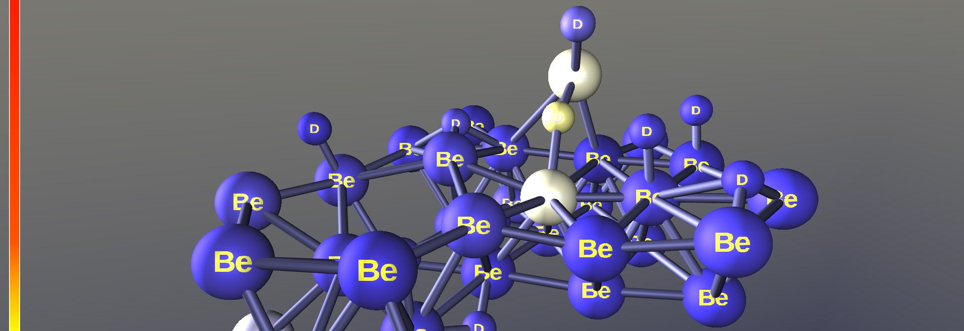
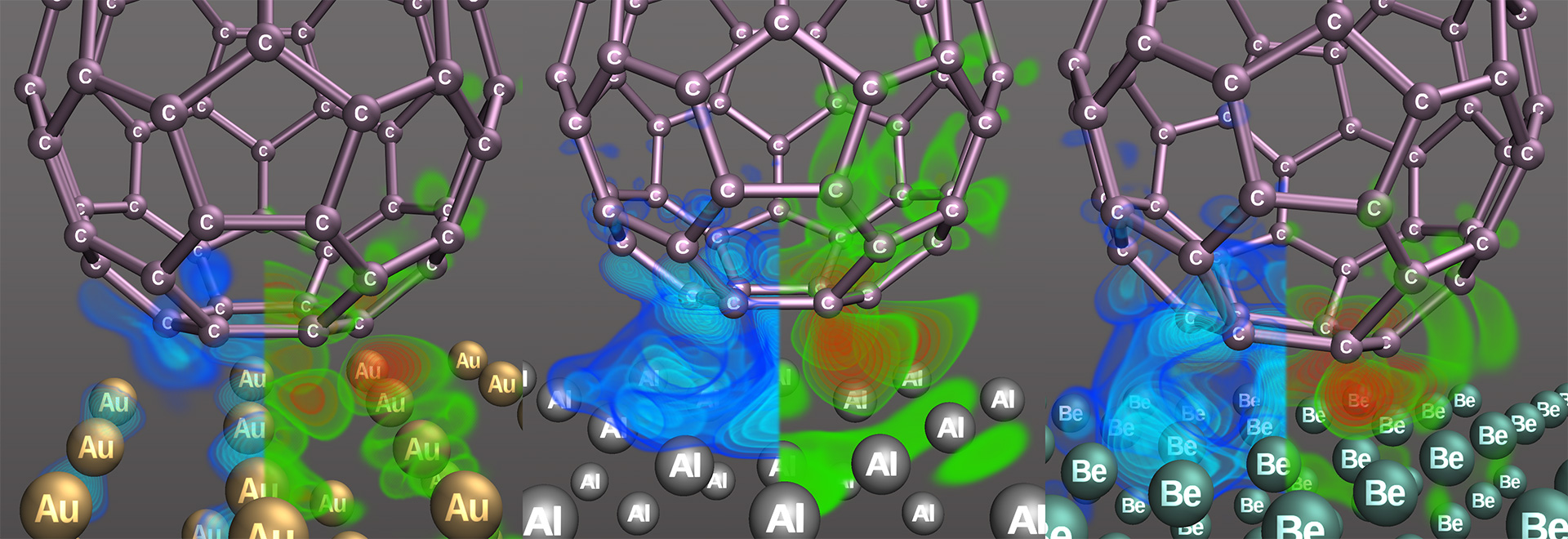
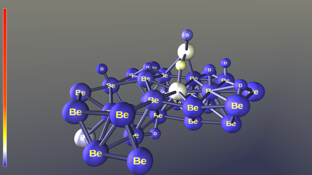
Molecular visualization of Fullerenes over three different metal plates: Gold, Aluminum, and Beryllium. It illustrates the result of a molecular dynamics simulation. The volume rendering in bluish and greenish colors shows negative and positive charge accumulation.
Atoms are rendered as OpenGL points, textured with color and font, and ray-traced to a sphere in the fragment shader stage. The bonds are generated via a geometry shader. The volume rendering uses a texture based approach in non-orthogonal coordinates. The visualization was implemented in vish. Data by Alexander Kaiser, Department for Numerical Chemistry, University of Innsbruck.
Atoms are rendered as OpenGL points, textured with color and font, and ray-traced to a sphere in the fragment shader stage. The bonds are generated via a geometry shader. The volume rendering uses a texture based approach in non-orthogonal coordinates. The visualization was implemented in vish. Data by Alexander Kaiser, Department for Numerical Chemistry, University of Innsbruck.
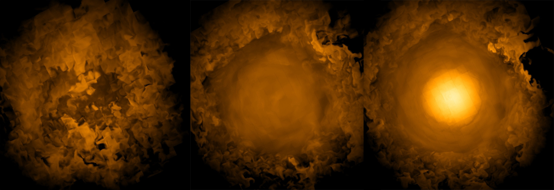
 super nova explosion data set - studying the influence of spacial dimension on the viability of a neutrino heating mechanism. The slices of the volume show the electron fraction Ye via a 'glow' color-map. The visualization was implemented in <a href=\"http://vish.fiberbundle.net\">vish</a>. Data by Jason Nordhaus and Adam Burrows, <a href=\"http://web.astro.princeton.edu\">Department of Astrophysical Science</a>, Princeton University")
Three snapshots of a 8TB adaptive mesh refinement (AMR) super nova explosion data set - studying the influence of spacial dimension on the viability of a neutrino heating mechanism. The slices of the volume show the electron fraction Ye via a 'glow' color-map. The visualization was implemented in vish. Data by Jason Nordhaus and Adam Burrows, Department of Astrophysical Science, Princeton University

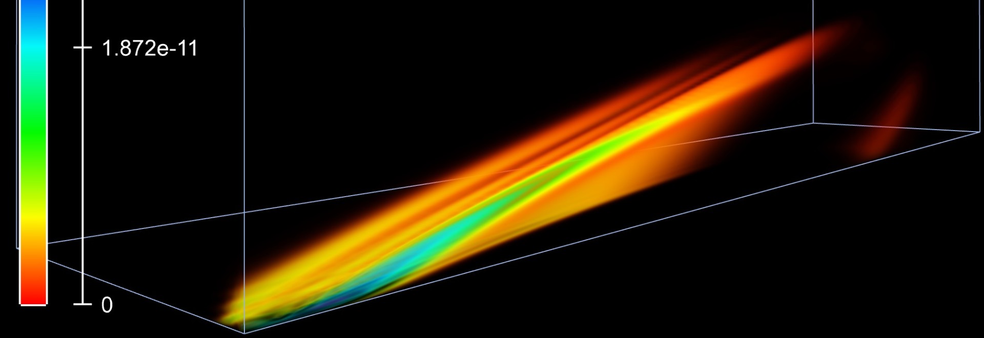
Streamlines visualizing a snapshot of a two fluids Large Eddy mixing simulation in a stir tank. The data-set is based on a curvi-linear 2088 multi-block grid. Streamlines are seeded in circular stripes and colored by arc-length. The visualization was implemented in vish. Data by Somnath Roy and Sumanta Acharya, Department of Mechanical Engineering, Louisiana State University.
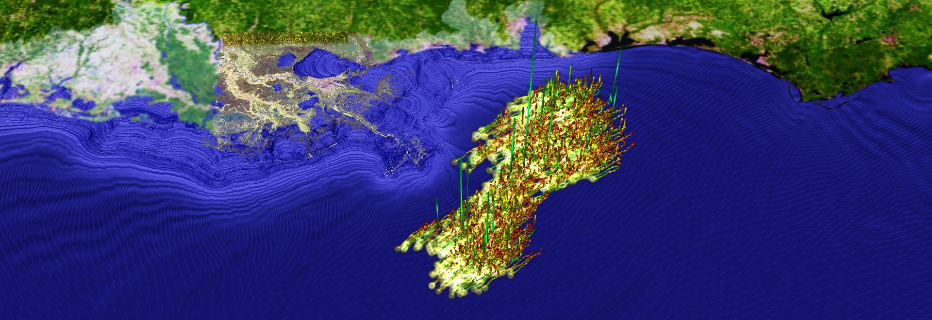
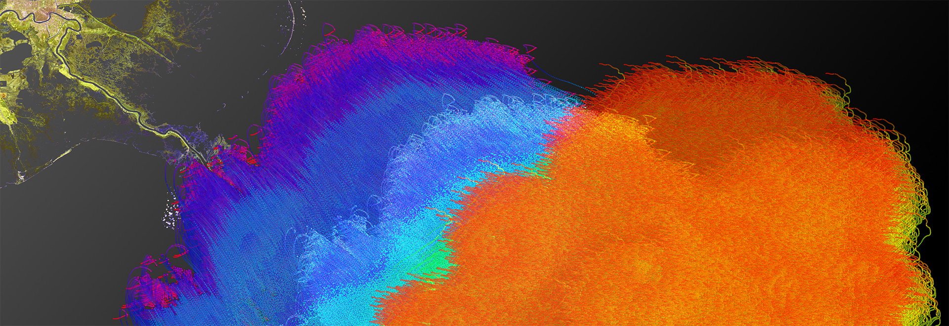
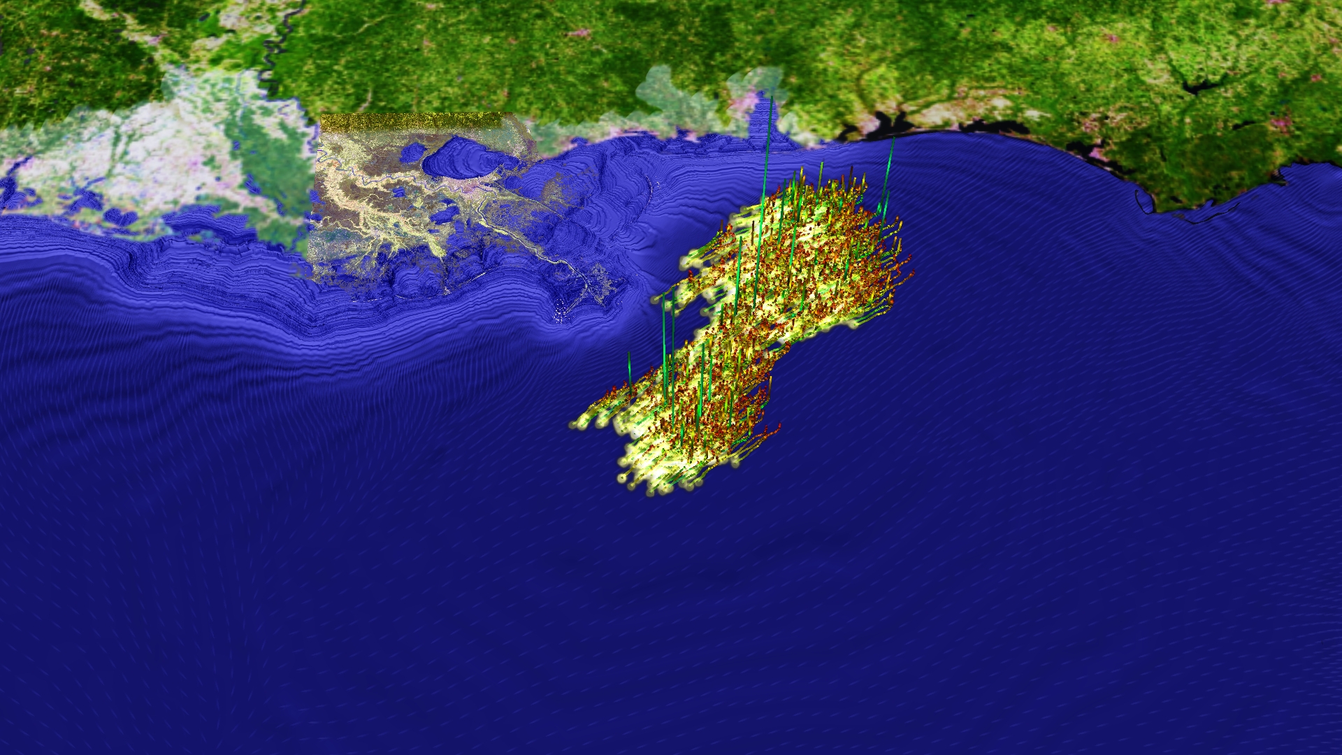
 influences the oil spill movement. The lines show trajectories of oil particles. The up coordinate was used to show curvature (when/where does the flow direction change quickly). The wind velocity field is illustrated via oriented speckles colored in red to white to blue. Ocean waves are shown as height field in blue colors. Satellite images support finding the geo-location (New Orleans), and finally the arrow indicates the moving direction of the eye of the hurricane. The visualization was done in <a href=\"http://vish.fiberbundle.net\">vish</a>. Data by Jian Tao, <a href=\"https://www.cct.lsu.edu/\">Center for Computation and Technology</a>, Louisiana State University.")
Visualization of an oil spill simulation. The case study analysis how a passing hurricane (Gustav) influences the oil spill movement. The lines show trajectories of oil particles. The up coordinate was used to show curvature (when/where does the flow direction change quickly). The wind velocity field is illustrated via oriented speckles colored in red to white to blue. Ocean waves are shown as height field in blue colors. Satellite images support finding the geo-location (New Orleans), and finally the arrow indicates the moving direction of the eye of the hurricane. The visualization was done in vish. Data by Jian Tao, Center for Computation and Technology, Louisiana State University.

Time surface visualization of a two fluid Large Eddy mixing simulation. The two spherical blobs are traced and deformed over time. The deformed surfaces visualize the flow and mixing behaviour in the stir tank. Image with Bidur Bohara. The visualization was implemented in vish. Data by Somnath Roy and Sumanta Acharya, Department of Mechanical Engineering, Louisiana State University.
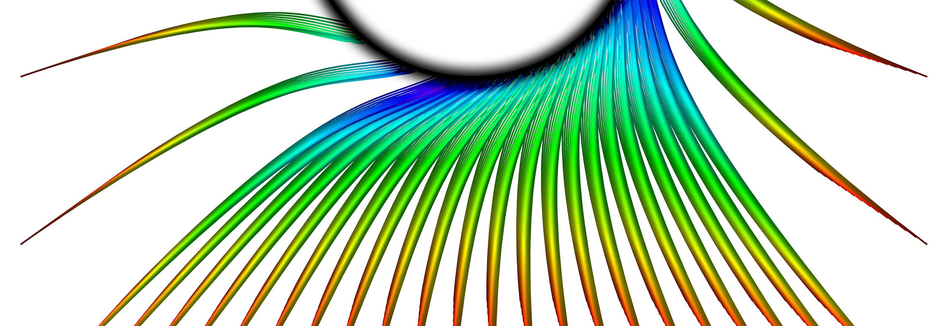
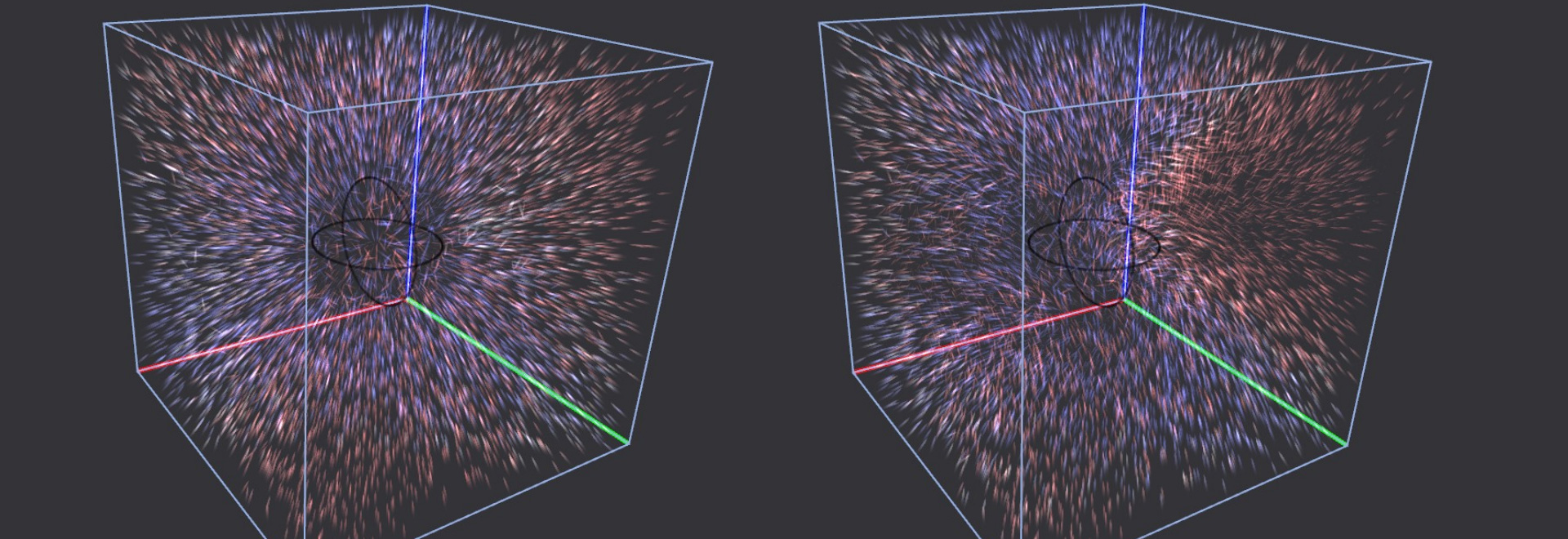
. The black circle illustrates the event horizon. The top row illustrates the acceleration of photons as yellow arrows and the bottom row as vector speckles. The initial velocity of the photons in drawn via blue arrows. The left column has a initial direction in positive x-axis, the right column shows photons at rest. The visualization was implemented in <a href=\"http://vish.fiberbundle.net\">vish</a>.")
Coordinate acceleration flow in a Schwarzschild metric (static black hole). The black circle illustrates the event horizon. The top row illustrates the acceleration of photons as yellow arrows and the bottom row as vector speckles. The initial velocity of the photons in drawn via blue arrows. The left column has a initial direction in positive x-axis, the right column shows photons at rest. The visualization was implemented in vish.
. Left column shows a small and the right column a large angular momentum. <br> The acceleration is illustrated using vector speckles, which indicate the direction by its shape and color. Red moves away and blue moves towards the observer. The positions are randomly interpolated in a space-time curvature field given on a uniform grid. The visualization was implemented in <a href=\"http://vish.fiberbundle.net\">vish</a>.")
Coordinate acceleration flow in a Kerr metric (rotating black hole). Left column shows a small and the right column a large angular momentum.
The acceleration is illustrated using vector speckles, which indicate the direction by its shape and color. Red moves away and blue moves towards the observer. The positions are randomly interpolated in a space-time curvature field given on a uniform grid. The visualization was implemented in vish.
The acceleration is illustrated using vector speckles, which indicate the direction by its shape and color. Red moves away and blue moves towards the observer. The positions are randomly interpolated in a space-time curvature field given on a uniform grid. The visualization was implemented in vish.

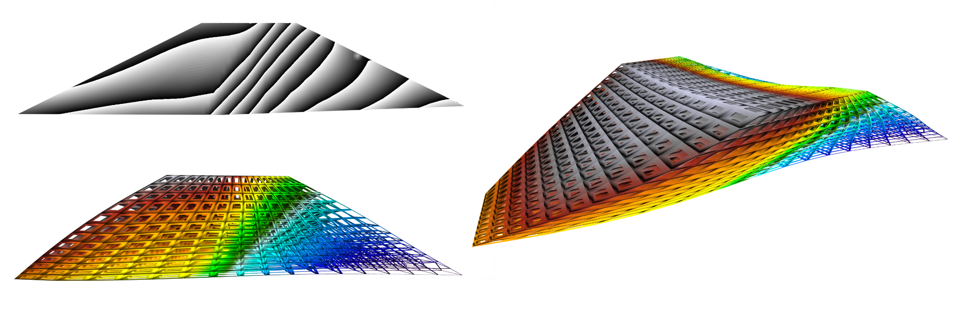
Deformation of a drying concrete cube with over-layed stress tensor visualization of a finite element simulation. Data by Matthias Aschaber @ the University of Innsbruck.
 represents capillary pressure of the coupled three phase simulation. The blueish colors indicates saturated soil. The top right image is a slice in the mid of the dam showing also capillary pressure by a zebra map. Data by Peter Gamnitzer, <a href=\"https://www.uibk.ac.at/bft/\">Department for Structural Analysis</a>, University of Innsbruck.")
Snapshot of an animation of an earth dam simulation. The deformed finite element structure is visualized. The color (and grid thickness) represents capillary pressure of the coupled three phase simulation. The blueish colors indicates saturated soil. The top right image is a slice in the mid of the dam showing also capillary pressure by a zebra map. Data by Peter Gamnitzer, Department for Structural Analysis, University of Innsbruck.

Eigenvector stream-lines of a triaxial stress test simulated with quadratic finite elements. Data by David Unteregger, Department for Structural Analysis, University of Innsbruck.

Couette flow visualized using streamlines seeded by four circle-shaped point
distributions - illustrated by white dots. The streamlines
of the inner circle flow in different circular direction compared to the outer
streamlines. The color represents arc length along the lines.

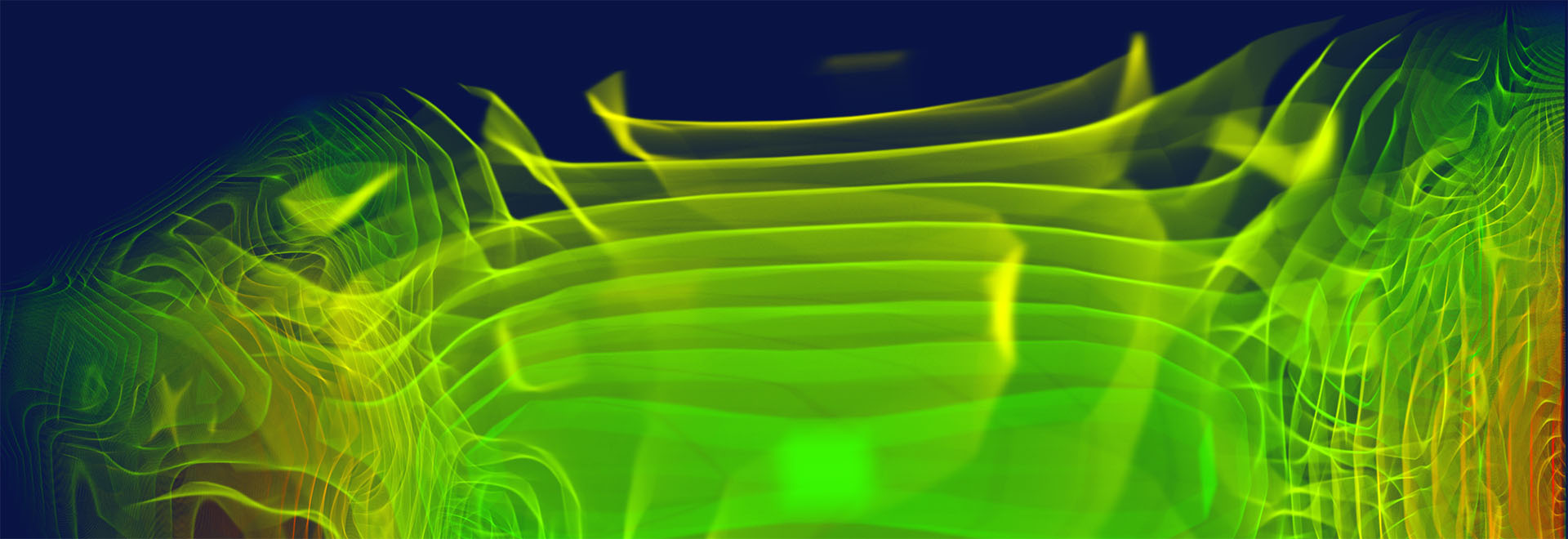
Time evolution of the solution of a advection diffusion reaction equation. Differences of numerical methods have been compared. Time goes from right to left. The visualization was implemented via Octave and vish. Data by Vu Thai Luan, Department of Numerical Analysis, University of Innsbruck.

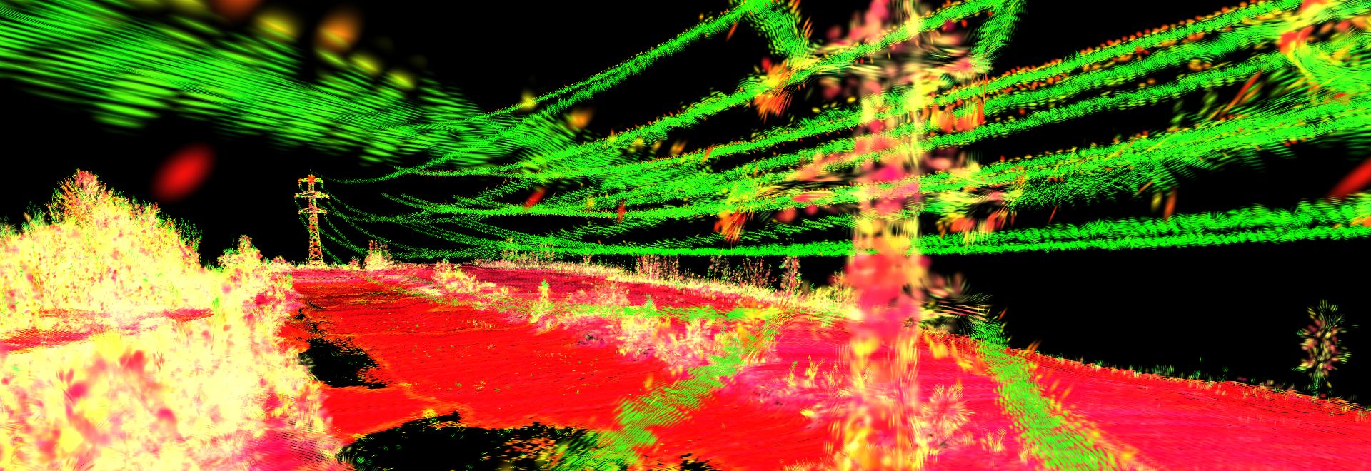
Visualization of the point distribution tensor of a Lidar point cloud. The tensor describes geometric properties of in a point neighborhood, similar to a principal component analysis. Here, linear structures, such as the power cable become visually directed and colored in green. The visualization was done in vish. Data captured by AHM.

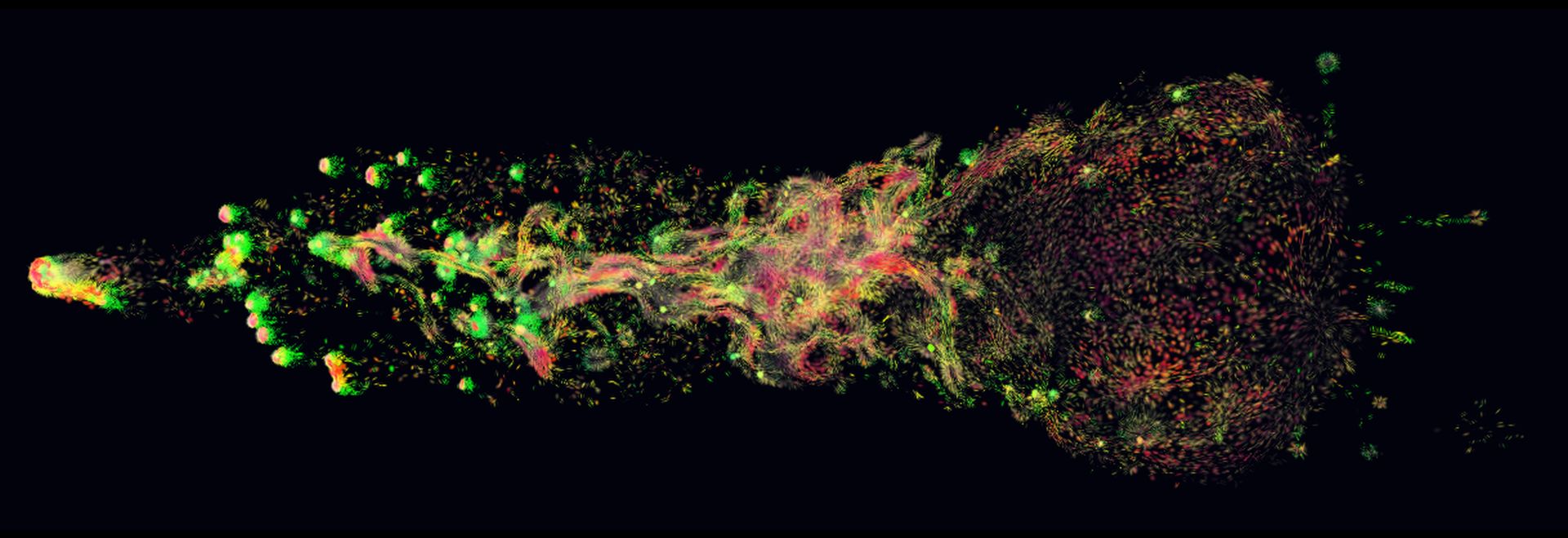
Point distribution tensor visualization of a SPH wind tunnel simulation of forming stars. Red indicates planar and green linear neighborhood distributions. Stars are born more in the linear tails of moving blobs. Data by Dominic Steinhauser, Institute for Astro- and Particle Physics, University of Innsbruck.

Point distribution tensor visualization of a SPH wind tunnel simulation of forming stars. Red indicates planar and green linear neighborhood distributions. Stars are born more in the linear tails of moving blobs. Data by Dominic Steinhauser, Institute for Astro- and Particle Physics, University of Innsbruck.

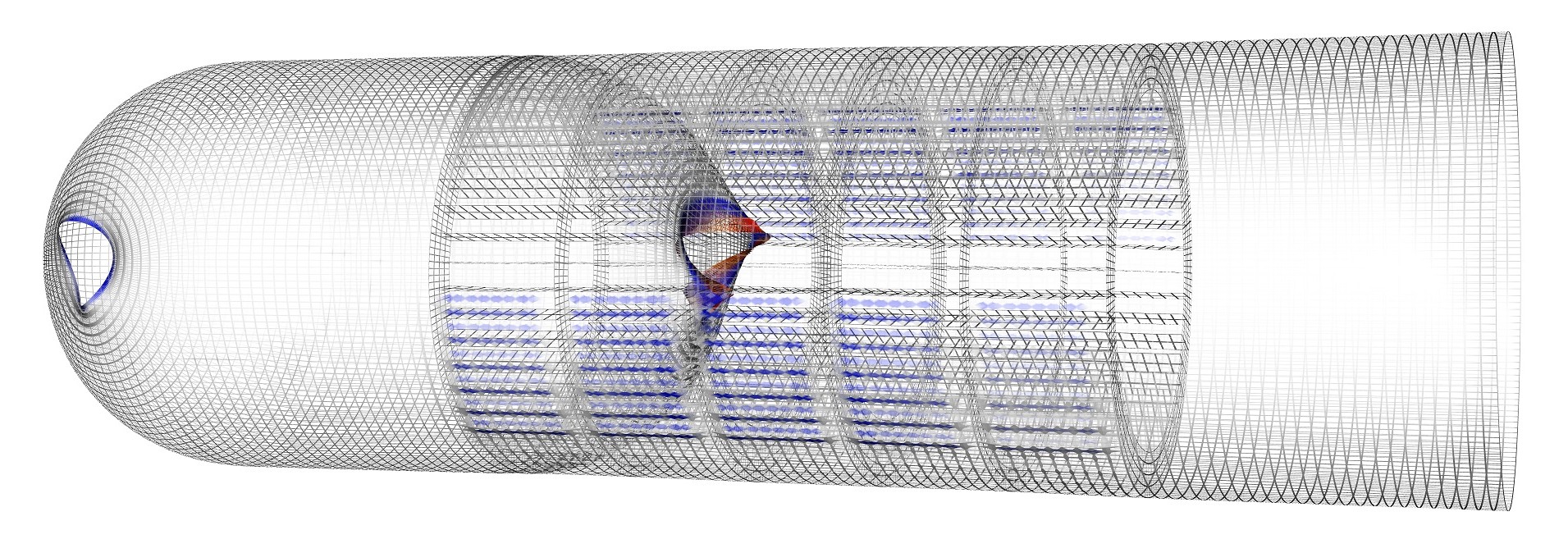
Finite element shell simulation of a rocket structure. The simulated grid is colored by a rotational component. Fading visibility enhances insight into the structure. The visualization was implemented in vish. Data by Vincent de Groof, Unit for Engineering Mathematics, University of Innsbruck.

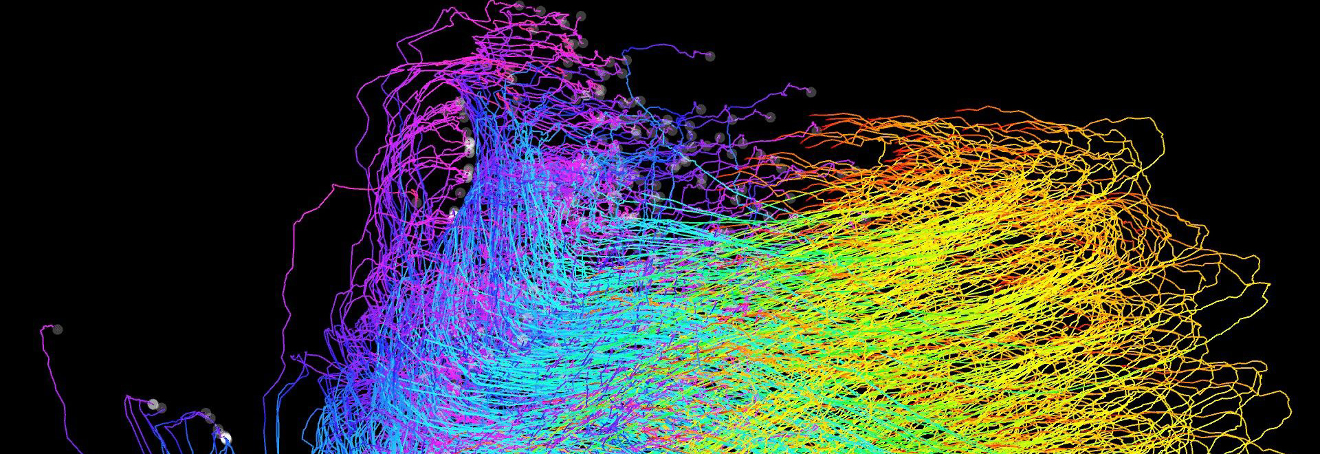
A particle visualization of oil spill trajectories in the golf of mexico. The HPC simulation was done in 2010 by Jian Tao. Particle prajectories are colored via a rainbow color-map over time, showing the space covered by oil spill over the whole simulation time series. Find more details on the NSF site and in the TeraGrid Science Highlights 2010
Scientific Visualization Images - Offline Rendered Graphics

Scalar density distribution loaded via HDF5 into a Maya volume container using a custom implemented plug-in. The transfer function was adjusted to result in onion volume slices. The 50x50x50 volume is interpolated smoothly during rendering. Implemented as a command plug-in in Maya.

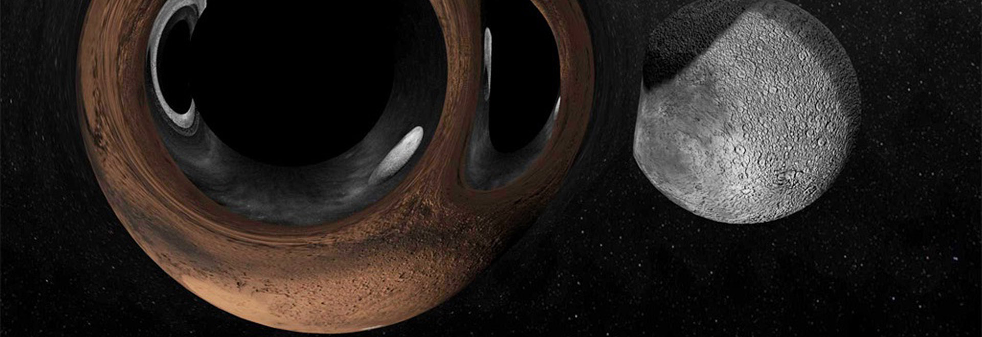
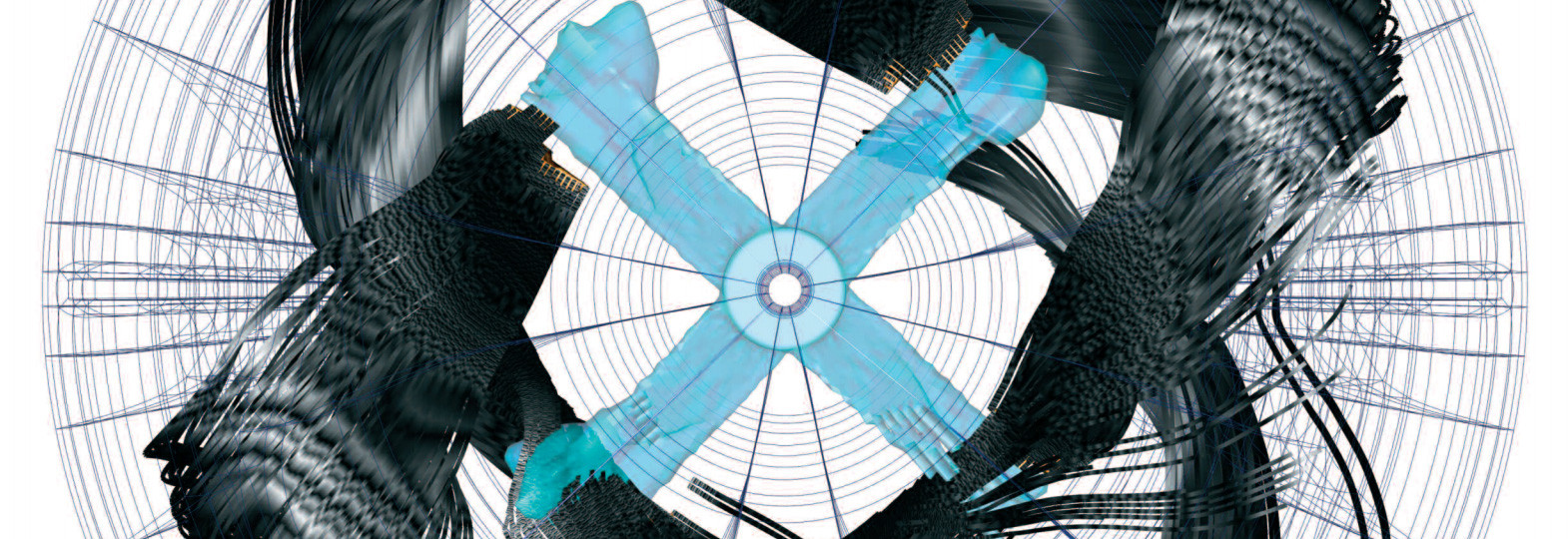
A black hole in the living room. A Schwarzschild metric distorts the space time of a living room, showing the effect of a gravitational lens in a familiar environment. Implemented as a material plug-in in Maya.

Two black holes in an artificial outer space scene. It shows the effect of a gravitational lens. Implemented as a material plug-in in Maya.